Redefining fitness with a powerful, energetic, playful and confident identity system to convey the brand philosophy of passion and determination.
Design Approach
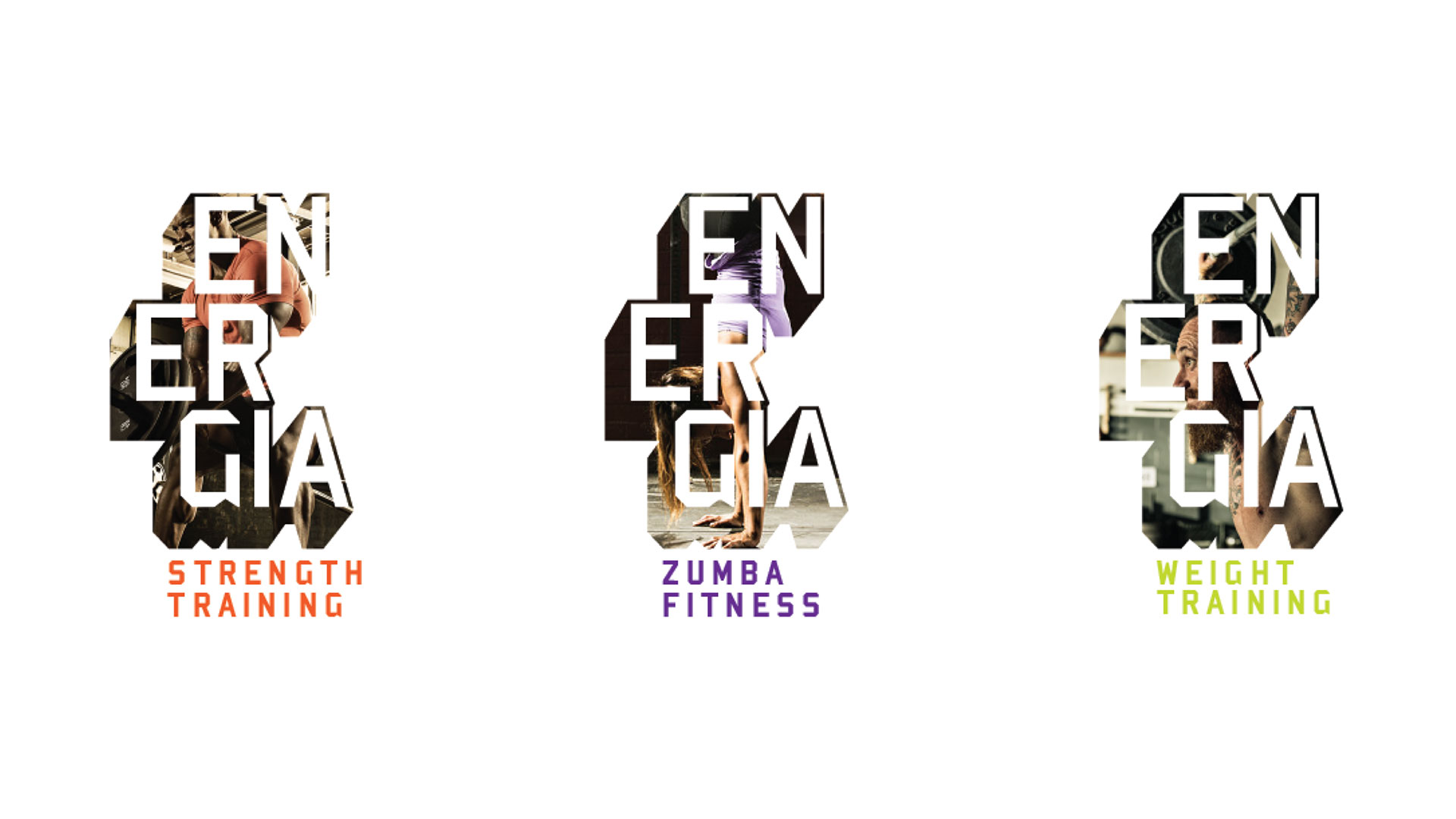
Energia is a new fitness centre offering unparalleled experiences and services like cardio, weight training, TRX, total resistance, kettlebell training, yoga, zumba, etc. Their passion for fitness and their philosophy of connecting with each individual according to their needs and putting overall fitness as their genuine interest ensure that you are placed on the right track for your fitness journey.
Being overall fit gives us the power, confidence and strength to move forward. We all want to have that power and use it to put our best foot forward. Being fit is a great way to achieve that power, both mentally and physically. It can inspire us to change our course of action.
Brand Design Language
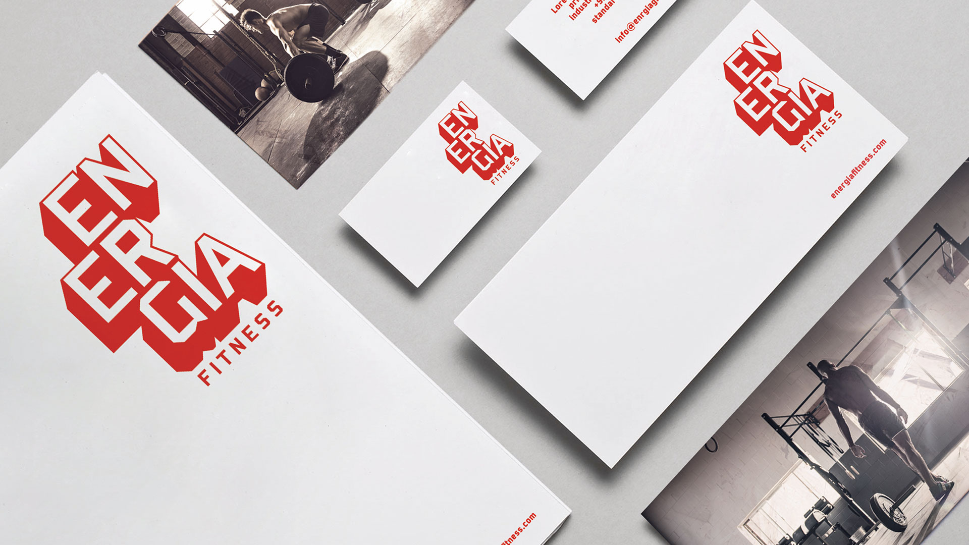
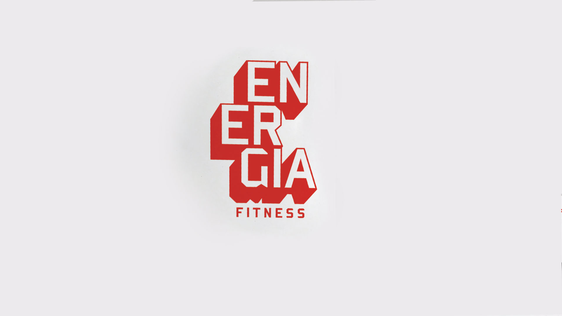
The Energia Fitness identity represents the same thought. The bold, confident wordmark captures the brand essence of power, stability, confidence, strength, and determination. This typographic approach gives the identity a unique geometric 3D look that doesn’t really exist in any other geometric sans typefaces. The subline alternates are used to display any titling and services. The identity, when used with a mix of motivational imagery and montages, creates a dynamic visual that evokes a feeling of persistence, strength, and energy with a strong emphasis on the brand name and helps build a unique brand personality.